Monday, July 11, 2011

Photo Contest Entry

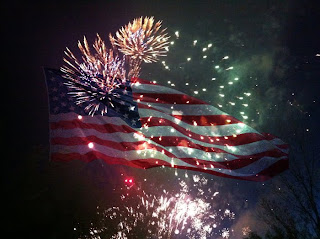
American Glory; 4-7-2011, 10:32pm; Idaho Falls, Idaho; f/2.8; 1/15; iPhone 4

I went to the fireworks show in Idaho Falls with the full intention of getting some really cool fireworks shots. i didn't realize until me and my friends got their that I had forgotten my camera. Thankfully I had my phone. I wasn't able to manipulate the shutter speed or aperture or set in on a tripod, so the method I used to get good shots was just to take as many shots as possible and hope a couple of them turned out. Thankfully I got a couple of shot that were in decent enough quality that I could use them.
The flag that I overlayed on the fireworks comes from an old photo blog I put together a couple of years ago. I had to pull the picture off that blog so it wasn't in great quality, but good enough to go along with the quality of the pictures I took with my phone.
I entered this picture in the Photographics Society Celebration contest. I thought this would be a fun contest to enter especially since it was the day after the 4th of July. It was really cool to see everyone's entries and their interpretations on celebration.
Submitted to contest July 5th, 2011

http://byuiphotographics.blogspot.com

Tuesday, June 28, 2011

Sunday, June 19, 2011

Poster Print


Bannack Buggy; 5-25-2011. 3:50pm; Bannack, MT; f/4.1; 1/180; Samsung PL60

Large format printing is a hassle, but I love how the poster came out. I was really worried that the picture would get too blurry when I blew it up to 24x36, but it came out nice and sharp.
I took the original buggy image and overlayed a picture of peeling paint on it to bring a little more to it. I then sharpened the whole image and adjusted the hue to make the wood look more natural. Last I boosted the saturation on most of the image, but that made the grass in the corner really bright, so I masked that out and darkened it a little bit in Camera Raw.

Sunday, June 12, 2011

Weekly Edits - Fine Art Templates

Secret Hideaway; 4-28-2011, 2:38pm; Nature Park, Rexburg, ID; f/8; 1/80; Nikon CoolPix P500


Bannack Scraps; 5/25/2011, 12:50pm; Bannack, MT; f/3.4; 1/25; Nikon CoolPix P500


I like the look of the fine art template, makes me feel fancy and professional. It was fairly simple to put together with the clipping masks. The hard part was getting a signature I was somewhat satisfied with. Looking at it now I'm still not entirely sure I like it. For the second one, I wanted to try something with color, fool around a bit. So I edited the original hue to give me something fun and pulled the color for the background out of that.

Night and Light

Have a seat; 6-12-2011, 10:41pm; Rexburg, ID; f/3.4; 8.0secs; Tripod; Flashlight

Look at the Light; 6-12-2011, 10;14pm; Rexburg, ID; f/4.0; 8.0secs; Tripod

Shake It Up; 6-12-2011, 10:23pm; Rexburg, ID; f/4,8; 5.0secs

Traffic In Motion; 6-12-2011, 10:31pm; Rexburg, ID; F/4.0; 4.0secs; Tripod

This weeks assignment was tough for me.. I was just totally lacking in original ideas of what to shoot, so I ended up putting it off until the night before it was due. Never a good idea.
For my light painting shot, I used the light from my phone to highlight the legs of the chair in my room. Of all the shots, I think this one came out the best for me this week. No big edits, just sat boostng.
For Light Sketching, I set my camera up on a tripod and used a laser pointer and wrote on the wall with the light. It took forever to get the shot right. My camera won't let me do a longer SS than 8 seconds, so I kept running out of time. I finally got it on about try #30. I used PhotoShop to change the color of the light from green to the fuscia and boosted the saturation.
Camera motion was my least favorite. I had my roommate hold up the light and I set the SS to five seconds and shook the camera around, nothing to special.
Blurred Lights came pretty easy. I waited for it too get dark, set up my camera at the corner near my apartment, waited for a car to come and got the shot. I like how you don't even see the car in the picture, just the line from the taillights. I did some adjustments in Camera Raw to lessen the yellow glow from the street lights.

Monday, June 6, 2011

Weekly Edits - Border Effects

Jillian; 5-19-2011, 3:15pm; Rexburg, ID; f/6.3; 1/250; Nikon CoolPix P500
Rustic Cowgirl; 5-25-2011, 1:45pm; Bannck, MT; f/4.4; 1/5; Nikon CoolPix P500; Tripod
Day's End Beverage; 5-25-2011, 5:15pm; Bannack, MT; f/5.0; 1/100; Dynamic Photo HDR

I really like some of the cool border effects you can create in Photoshop, and they are pretty quick to do as well. For the first picture, I created a flexible vignette. I decided to add the white stroke to the inside of the border rather than feathering the border. For Rustic Cowgirl, I applied a sponge effect with reduced opacity to the original image. I used the brushed on effect using the history brush to add the border. I like how certain parts of the picture come through more than others. My favorite is the root beer bottles. I first edited the image using Dynamic Photo HDR to give it the red color and enhanced lighting. I like the effect of the double fade border and how it pulls your attention to the middle of the image.

Sunday, June 5, 2011

Scannography

Money Grows; 6-5-2011, 4:00pm; Rexburg, Idaho; Canon Pixma MX340 Scanner


All Hand Shots - 6-5-2011; 4:45pm; Rexburg, Idaho; Canon MX340 Scanner

I was nervous about this weeks assignment. I have never really used a scanner much, just for some old pictures of my family, but I was pleasantly surprised to see what I came up with. For the Single Scan Image created a landscape shot using some coins I has laying around. I really like how you can see all the details from the coins, how each one has different imperfections on it. For my blend image, I decided to use Photoshop for to create a panoramic image. I scanned my hand five different times in the different positions then used the photomerge function in PS. I darkened the blacks to remove some fingerprints you could see from the glass of the scanner.